Material UI
Installation
MUI (https://mui.com/) provides component libraries and tools for React. We are going to use Material UI that is a library of React UI components that implements Google's Material Design (https://mui.com/material-ui/getting-started/).
To start using Material UI, you have to install it to your project using the following npm command. In this chapter, we use Todolist app with description, date and priority fields that we implemented earlier in React Project section:
npm install @mui/material @emotion/react @emotion/styled
The installed packages are saved to the package.json file's dependencies section. The package.json file can be found in the root directory of project. It contains project information, dependencies and scripts for starting the project. After the installation, open the package.json file and check that Material UI components are found from the dependencies node.
"dependencies": {
  "@emotion/react": "^11.14.0",
  "@emotion/styled": "^11.14.0",
  "@mui/material": "^6.4.7",
  "react": "^19.0.0",
  "react-dom": "^19.0.0"
},
In the line "@mui/material": "^6.4.7" the @mui/material is the name of the installed package. The "^6.4.7" specifies the installed version. The ^ symbol indicates that it allows to receive bug fixes and minor version updates. The major version updates are not allowed (For example, 7.0.0).
The packages are automatically updated when you execute the npm install command. The installed versions are saved to the dependency lock file package.lock.json file. If the version is specified "6.4.7" it means that the project requires version 6.4.7 and updates are not received automatically.
If you want to use icons, you should install the following library:
npm install @mui/icons-material
Material UI uses Google Roboto fonts and you can read the installation instructions in https://mui.com/material-ui/getting-started/installation/#roboto-font.
We won't use Vite's default styling anymore. Remove the css-file imports from the App.tsx and main.tsx files.
Container
First, we will use the Container component, which is basic layout component, and it centers your app content horizontally. The maxWidth props defines the maximum width of our app, and we are using the largest value. We will also use the CssBaseline component that is used to fix inconsistencies across different browsers.
Open the App.tsx file and do the following modifications:
import Container from '@mui/material/Container'
import CssBaseline from '@mui/material/CssBaseline'
import TodoList from './TodoList'

function App() {
  return (
    <Container maxWidth="xl">
      <CssBaseline />
      <TodoList />
    </Container>
  )
}

export default App
Now, we are ready to use other UI components.
Button
Instead of using HTML button element, we can now use Material UI Button component (https://mui.com/material-ui/react-button/).
Open the TodoList.tsx and TodoTable.tsx files and add the following import to both files:
import Button from '@mui/material/Button'
Then, we change the HTML button elements to the Button component:
  return(
    <>
      <input
        placeholder="Description"
        onChange={event => setTodo({...todo, description: event.target.value})}
        value={todo.description}
      />
      <select
        title="Priority"
        onChange={event => setTodo({...todo, priority: event.target.value as 'low' | 'medium' | 'high'})}
        value={todo.priority}
      >
        <option value="low">Low</option>
        <option value="medium">Medium</option>
        <option value="high">High</option>
      </select>
      <input
        placeholder="Date"
        type="date"
        onChange={event => setTodo({...todo, date: event.target.value})}
        value={todo.date}
      />
      <Button onClick={addTodo}>Add</Button>
      <TodoTable todos={todos} handleDelete={deleteTodo} />
    </>
  );
  return(
    <table>
      <thead>
        <tr>
          <th>Description</th>
          <th>Priority</th>
          <th>Duedate</th>
          <th>Actions</th>
        </tr>
      </thead>
      <tbody>
        {props.todos.map((todo, index) => (
          <tr key={index}>
            <td>{todo.description}</td>
            <td>{todo.priority}</td>
            <td>{todo.date}</td>
            <td>
              <Button onClick={() => props.handleDelete(index)}>
                Delete
              </Button>
            </td>
          </tr>
        ))}
      </tbody>
    </table>
  )
Material UI has three different button variants (styles): Text, Outlined, and Contained. The default variant used in Material UI is Text. You can use variant prop to change the style.
// Change button variant
<Button variant="contained" onClick={addTodo}>
  Add
</Button>
You can change the button color by using the color prop. You can find the examples in https://mui.com/material-ui/react-button/#color and change your Delete button color to red.
<Button
  variant="contained"
  size="small"
  color="error"
  onClick={() => props.handleDelete(index)}
>
  Delete
</Button>
The Button component props are listed in https://mui.com/material-ui/api/button/.
TextField
The Material UI provides TextField component (https://mui.com/material-ui/react-text-field/) that let user enter and edit text. We will use that in our Todolist app instead of HTML input elements.
To start use the TextField component, import it in the TodoList component.
import TextField from '@mui/material/TextField'
The label prop is used to set label for TextField components.
 return(
    <>
      <TextField
        label="Description"
        onChange={event => setTodo({...todo, description: event.target.value})}
        value={todo.description}
      />
      <select
        helperText="Select priority"
        onChange={event => setTodo({...todo, priority: event.target.value as 'low' | 'medium' | 'high'})}
        value={todo.priority}
      >
        <option value="low">Low</option>
        <option value="medium">Medium</option>
        <option value="high">High</option>
      </select>
      <TextField
        label="Date"
        onChange={event => setTodo({...todo, date: event.target.value})}
        value={todo.date}
      />
      <Button variant="contained" onClick={addTodo}>
        Add
      </Button>
      <TodoTable todos={todos} handleDelete={deleteTodo} />
    </>
  );
Material UI has three different text field variants (styles): Standard, Outlined, and Filled. The default variant used in Material UI is Outlined. You can use variant prop to change the style.
The TextField component props are listed in https://mui.com/material-ui/api/text-field/.
Next, we will replace the select element with a Material UI component. The Material UI TextField component can also handle select functionality by using its select prop. See examples at https://mui.com/material-ui/react-text-field/#select.
<TextField
  label="Priority"
  select
    slotProps={{
    select: {
      native: true,
    },
  }}
  onChange={event => setTodo({...todo, priority: event.target.value as 'low' | 'medium' | 'high'})}
  value={todo.priority}
>
  <option key="low" value="low">Low</option>
  <option key="medium" value="medium">Medium</option>
  <option key="high" value="high">High</option>
</TextField>
Now, your UI should look like the following:
It doesn't look good enough yet. To get some spacing between components and align these properly, we can use the layout component called Stack.
Stack is one dimensional layout component that we can use to set spaces between text fields and set alignments. To get started, add the following import to the TodoList.tsx file.
import Stack from '@mui/material/Stack'
Next, we wrap the Button and textField components with the Stack component. The Stack component layout is using Flex and the default direction is column. We set direction to row using the component's direction prop. The spacing prop is used to set spacing between items inside the Stack component. You can read more about spacing and units in https://mui.com/material-ui/customization/spacing/.
return(
    <>
      <Stack direction="row" spacing={2}>
        <TextField
          label="Description"
          onChange={event => setTodo({...todo, description: event.target.value})}
          value={todo.description}
        />
        <TextField
          label="Priority"
          select
          slotProps={{
            select: {
              native: true,
            },
          }}
          onChange={event => setTodo({...todo, priority: event.target.value as 'low' | 'medium' | 'high'})}
          value={todo.priority}
        >
          <option key="low" value="low">Low</option>
          <option key="medium" value="medium">Medium</option>
          <option key="high" value="high">High</option>
        </TextField>
        <TextField
          label="Date"
          onChange={event => setTodo({...todo, date: event.target.value})}
          value={todo.date}
        />
        <Button variant="contained" onClick={addTodo}>
          Add
        </Button>
      </Stack>
      <TodoTable todos={todos} handleDelete={deleteTodo} />
    </>
  );
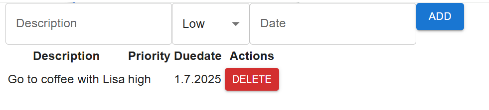
Finally, we set some top margin with prop mt and center the components horizontally and vertically with props justifyContent and alignItems. The component specific style definitions are done in an sx prop to make the styling values theme-aware,
<Stack
  direction="row"
  spacing={2}
  sx={{
    mt: 2,
    justifyContent: "center",
    alignItems: "center"
  }}
>
Now, your Todolist inputs and button should look the following:

The sx prop
MUI components accept the sx prop for styling. It uses the MUI System, so you can set CSS-like properties in a JS object and use theme-aware values. This is the recommended way to do one-off component styling without creating a separate CSS file.
Key ideas:
sxaccepts a style object (or an array of objects).- Many properties support theme spacing, e.g.
mt: 2maps to theme spacing units. - You can use responsive values with breakpoints.
<Stack
  direction="row"
  spacing={2}
  sx={{
    mt: 2,            // margin-top in theme units
    px: 2,            // x-axis padding in theme units
    gap: 2,           // flex gap in theme units
    bgcolor: "background.paper",  // background-color as a theme palette token
    py: { xs: 1, sm: 2 }, // responsive padding on y-axis
  }}
>
  ...
</Stack>
See the documentation for more information, e.g.
- sx-prop: https://mui.com/system/getting-started/the-sx-prop/
- system properties and their relation to theme: https://mui.com/system/properties/.
- spacing props: https://mui.com/system/spacing/
Validation
Form validation is a important part of front end development. The Material UI TextField component includes props that can be used in validation. For instance, if the description field in our Todolist app is mandatory, we can utilize the required prop of the TextField component. This will mark the field as required by displaying a *.
<TextField
  label="Description"
  onChange={event => setTodo({...todo, description: event.target.value})}
  value={todo.description}
  required
/>
Now, the description text field looks the follwing:

Then, we can use error prop to indicate if validation error occurs. If the error prop value is true, the label and border is displayed in red color. Create a state to control if description value is provided.
const [descriptionError, setDescriptionError] = useState(false);
In the addTodo function, you can verify the description value and update the state to true if the value is either undefined or null, otherwise we set state to false:
  const addTodo = () => {
    if (!todo.description) {
      setDescriptionError(true);
    }
    else {
      setDescriptionError(false);
      setTodos([...todos, { ...todo, id: uuidv4()}]);
      setTodo({id: '', description: '', priority: 'low', date: '',});
    }
  };
The error prop is linked to the descriptionError state:
<TextField
  label="Description"
  onChange={event => setTodo({...todo, description: event.target.value})}
  value={todo.description}
  required
  error={descriptionError}
/>
If you add a new todo without filling in the description field, it will be highlighted in red:

The helperText prop can be used to provide feedback to the user about the error.
There are also third-party form libraries available that can be used for more advanced form handling:
- Formik: https://formik.org/
- React Hook Form: https://react-hook-form.com/
App Bar
Material UI app bar displays information and actions relating to the current screen. We can implement the app bar by using the Material UI AppBar component (https://mui.com/material-ui/react-app-bar/).
We will implement app bar in the App component. Add the following imports to your App.tsx file.
import AppBar from '@mui/material/AppBar'
import Toolbar from '@mui/material/Toolbar'
import Typography from '@mui/material/Typography'
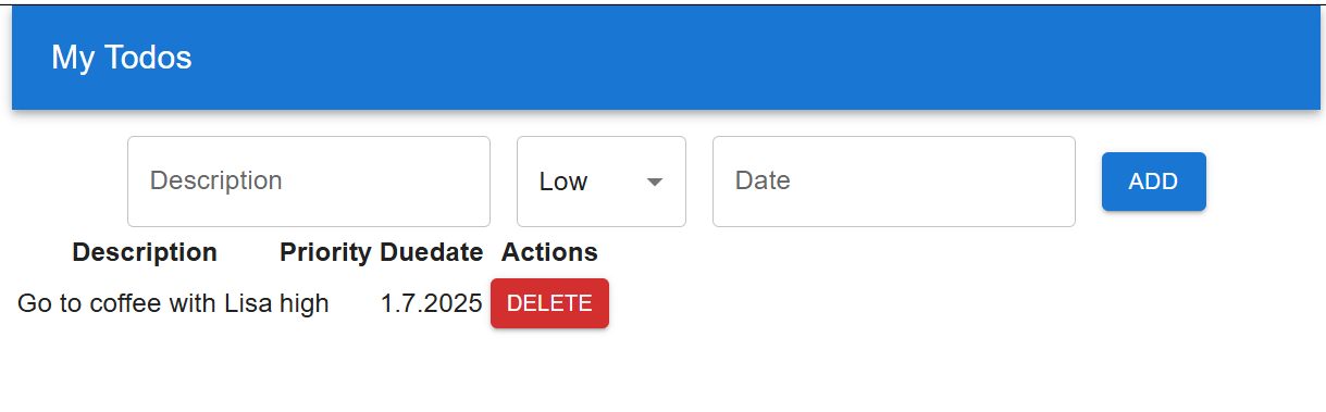
Then, render the components in the App component. The AppBar component's position defines the positioning fo the app bar. When you set position="static", the AppBar remains at the top of the screen and does not scroll with the content. You can see the possible values in https://mui.com/material-ui/api/app-bar/#AppBar-prop-position. The Typography component provides predefined text sizes, and we will use this in our toolbar text. variant props can be used to define text size:
function App() {
  return (
    <Container maxWidth="xl">
      <CssBaseline />
      <AppBar position="static">
        <Toolbar>
          <Typography variant="h6">My Todos</Typography>
        </Toolbar>
      </AppBar>
      <TodoList />
    </Container>
  )
}
Now, if you look the Todolist UI, it already looks nice but now you need some spacing between the app bar and text fields. You can use the mt prop of the Stack component to get top margin to your text fields and buttons. The Material UI provides custom props that you can use to change CSS properties https://mui.com/system/properties/#properties-reference-table
<Stack direction="row" spacing={2}
  sx={{
    mt: 2,
    justifyContent: "center",
    alignItems: "center"
  }}>
Finally, your Todolist should look like the following screenshot:
Next, we will enhance the styling of our table by using the MUI DataGrid component.