DataGrid
MUI has a product called MUI X (https://mui.com/x/) that provides advaced components such as data grid, charts and date picker.
Now, we will replace the HTML table with the DataGrid in our Todolist app. Then, we can easily add useful features such as sorting, filtering, etc. to our todo list app.
Install DataGrid
To start use MUI X DataGrid component, you have to install it using the following npm command:
npm install @mui/x-data-grid
Unique id
Material UI's DataGrid component requires each row to have a unique identifier. By default, the DataGrid looks for a property named id in the data set to get that identifier. Our current todo items lack this unique identifier. If the row's identifier is not called id, then you need to use the getRowId prop to tell the DataGrid what field to uses.
Typically, data fetched from a REST API includes unique identifiers. In our case, we don't have a unique identifier in todo items. Let's update our app to include unique ids for our todo items using the uuid library (https://github.com/uuidjs/uuid), which can be used to generate unique ids.
Install the uuid library:
npm install uuid
The following example show how to genrate an id using the uuid library:
import { v4 as uuidv4 } from 'uuid';
uuidv4(); // '9b1def4d-2b7d-1bad-9bdd-2b0dwa3dcb6f'
Open the types.ts file and add ìd property to the Todo type:
export type Todo = {
  id: string;
  description: string;
  priority: 'low' | 'medium' | 'high';
  date: string;
}
Import uuid to the TodoList component and generate unique id when new todo is added:
import { useState } from 'react';
import type { Todo } from './types';
import TodoTable from './TodoTable';
import Button from '@mui/material/Button';
import TextField from '@mui/material/TextField';
import Stack from "@mui/material/Stack";
import { v4 as uuidv4 } from 'uuid';

function TodoList() {
  const [todo, setTodo] = useState<Todo>({id: '', description: '', priority: 'low', date: ''});
  const [todos, setTodos] = useState<Todo[]>([]);

  const addTodo = () => {
    if (!todo.description || !todo.date) {
      alert("Enter values first!");
    }
    else {
      setTodos([...todos, { ...todo, id: uuidv4()}]);
      setTodo({id: '', description: '', priority: 'low', date: '',});
    }
  };

  // continue...
Now, when you add a new todo, it contains a unique id field.
Import DataGrid component and define columns
Import Datagrid to your TodoTable component:
import { DataGrid } from '@mui/x-data-grid';
Columns are defined using objects and the type of objects is GridColDef, that is interface provided by DataGrid (https://mui.com/x/api/data-grid/). The required field property is used to define where the field get its value. For example, the column with field description will display the value stored in todo.description.
// Import GirdColDef type
import type { GridColDef } from '@mui/x-data-grid';

// Define columns
const columns: GridColDef[] = [
  { field: 'description' },
  { field: 'priority' },
  { field: 'date' },
]
Display DataGrid
Then, we display the DataGrid component. The rows prop defines where row data comes from and the value should be an array. In our case, it is the todos array state that is passed to the TodoTable component using props. The columns prop defines the column definition, and it is the columns that we just created before. You have to wrap the DataGrid component inside div that defines the grid size. You can also use flex container with flex-direction: 'column'.
return(
  <div style={{ height: 500, width: '60%', margin: 'auto' }}>
    <DataGrid rows={props.todos} columns={columns} />
  </div>
)
Column properties
The column properties are used to define the column behavior. So far, we have only used the field property in our column definitions. You can find all column properties at https://mui.com/x/react-data-grid/column-definition/. By default, column sort is enabled. Set sortable property to false to disable sorting on a column.
If you type a todo with a long description, you can see that it doesn't fit to the column. The default width of column is 100px and you can change it using the width property:
// Set column width
const columns: GridColDef[] = [
  { field: 'description', width: 300 },
  { field: 'priority' },
  { field: 'date', width: 150 },
]
Now, the todo list app look the following:
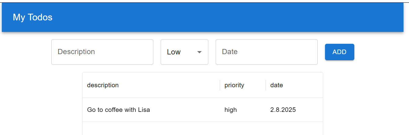
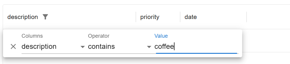
Each column headers also contain a menu that opens the column filter and other functionalities.
The column header text can be defined using the headerName property. By default, the header title is derived from the field property:
// Set column width
const columns: GridColDef[] = [
  { field: 'description', headerName: 'Description', width: 300 },
  { field: 'priority', headerName: 'Priority', },
  { field: 'date', headerName: 'Due date', width: 150 },
]
Next, we will implement delete funtionality.
Delete functionality
In this phase, we will use Material Icons. If you haven't installed them yet, you can do so by following the instructions here: http://mui.com/material-ui/getting-started/installation/#icons
Previously, we implemented the delete functionality by using the row index. Now, we have a unique id property that we can use to delete todo items. The type of the id is string, so we have to do some changes to our types and deleteTodo function.
Update the handleDelete function to accept an id parameter of type string.
export type TodoTableProps = {
  todos: Todo[];
  handleDelete: (id: string) => void;
}
Update the deleteTodo function to accept an id parameter of type string and use the todo.id property in the filter method.
const deleteTodo = (id: string) => {
  setTodos(todos.filter(todo => id !== todo.id));
};
By default, columns are shown as strings in DataGrid. You can define column type to be actions. The actions column type is used to define a column that contains action buttons or icons.
const columns: GridColDef[] = [
  { field: 'description', headerName: 'Description', width: 300 },
  { field: 'priority', headerName: 'Priority', },
  { field: 'date', headerName: 'Due date', width: 150 },
  {
    field: 'actions',
    type: 'actions',
    headerName: 'Actions',
    // action buttons
  },
]
If the column type is actions, you need to provide a renderCell function that returns GridActionsCell component with GridActionsCellItem elements as children. The renderCell method allows you to customize cell rendering to display components like buttons or icons instead of plain text (see https://mui.com/x/react-data-grid/column-definition/#rendering-cells).
The type of the params that is passed to renderCell function is GridRenderCellParams. Import GridRenderCellParams from @mui/x-data-grid.
const columns: GridColDef[] = [
  { field: 'description', headerName: 'Description', width: 300 },
  { field: 'priority', headerName: 'Priority', },
  { field: 'date', headerName: 'Due date', width: 150 },
  {
    field: 'actions',
    type: 'actions',
    headerName: 'Actions',
    renderCell: (params: GridRenderCellParams) =>
      // actions
  },
]
The params object passed to renderCell function includes:
rowproperty: Contains the row model for accessing values from the current row.idproperty: Provides the grid row id, which can be used for row deletion.
Next, we will implement the actions. Import the delete icon from mui/x-data-grid.
import DeleteIcon from '@mui/icons-material/Delete';
You can explore the icons available in the Material Icons library here: https://mui.com/material-ui/material-icons/.
Next, import and display GirdActionsCell and GridActionsCellItem to implement actions. The icon prop specifies the icon to display, and the onClick event handler defines the function to execute when the action is clicked. In our case, we call handleDelete function and pass todo id as an argument.
https://react.dev/learn/passing-props-to-a-component#forwarding-props-with-the-jsx-spread-syntax
const columns: GridColDef[] = [
  { field: 'description', headerName: 'Description', width: 300 },
  { field: 'priority', headerName: 'Priority', },
  { field: 'date', headerName: 'Due date', width: 150 },
  {
    field: 'actions',
    type: 'actions',
    headerName: 'Actions',
    renderCell: (params: GridRenderCellParams) =>
      <GridActionsCell {...params}>
        <GridActionsCellItem
          icon={<DeleteIcon />}
          onClick={() => props.handleDelete(params.id as string)}
          label="Delete" />
      </GridActionsCell>
  },
]
The {...params} in GridActionsCell is so called forwarding props that is standard pattern in React. It forwards props to the GridActionsCellItem components without listing each of their names. You can read more in React documentation here.
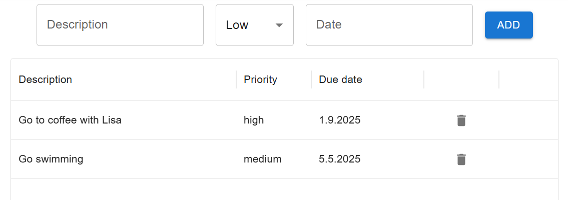
Now, you can see delete icon in each row and when you click it, the row is deleted:
If you want to show actions in row menu you can use showInMenu prop:
<GridActionsCellItem
  icon={<DeleteIcon />}
  onClick={() => props.handleDelete(params.id as string)}
  label="Delete"
  showInMenu
/>
You can read more about DataGrid column types in https://mui.com/x/react-data-grid/column-definition/#column-types.