AG-Grid
- AG-Grid (https://www.ag-grid.com/) is popular data grid component that can be used with several JavaScript libraries, such as React.
- AG-grid provides a free community version that is free for everyone, including production use - no license required.
- We have developed the Todolist app, and if you have done the assignments, you should now also have date field and delete functionality.
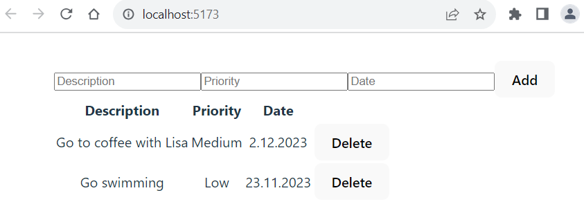
- Let's add a third property to our Todolist that is a priority. Add the
priorityproperty to thetodostate and add an input element that user can enter priority which is stored to the state. Then, your Todolist should look like the following screenshot:
- Now, we will replace the HTML table with the AG-Grid component in our Todolist app. Then, we can easily get nice features such as sorting, filtering, etc. to our Todolist app.
- Move to your Todolist project folder using the command line.
Install AG-Grid
- First, you have to install the AG-Grid component in your project. The installation command can be found in the component's documentation. In this case in https://www.ag-grid.com/react-data-grid/getting-started/. The npm command is the following and you should execute it in your project folder:
npm install ag-grid-react
- The installed packages are saved to the
package.jsonfile'sdependenciessection. Thepackage.jsonfile can be found in the root directory of project. It contains project information, dependencies and scripts for starting the project. After the installation, open thepackage.jsonfile and check that AG-Grid component is found.
"dependencies": {
  "ag-grid-react": "^32.1.0",
  "react": "^18.2.0",
  "react-dom": "^18.2.0"
},
In the line "ag-grid-community": "^32.1.0" the ag-grid-community is the name of the installed package. The "^32.1.0" specifies the installed version. The ^ symbol inidcates that it allows to receive bug fixes and minor version updates. The major version updates are not allowed (For example, 33.0.0). The packages are automatically updated when you execute the npm install command. The installed versions are saved to the dependency lock file package.lock.json file. If the version is specified "32.1.0" it means that the project requires version 32.1.0 and updates are not received automatically.
Import AG-Grid component and stylesheets
- To use the AG-Grid component in our TodoList component, we have to import it. We import the
AgGridReactcomponent and stylesheets. AG-Grid provides pre-defined themes (https://www.ag-grid.com/react-data-grid/themes/) and we use the Material Design theme. Add the following imports to yourTodoListcomponent.
import { AgGridReact } from "ag-grid-react";

import "ag-grid-community/styles/ag-grid.css";
import "ag-grid-community/styles/ag-theme-material.css"; // Material Design theme
Define columns
- Next, we have to define data grid columns. The columns are defined using a state, and the value is an array of column definition objects. Each column definition object has a mandatory property
fieldthat defines what data is shown in a column. For example, if we define{field: 'date'}, this column shows ourtodoobject'sdateproperty value.
const [columnDefs, setColumnDefs] = useState([
  {field: 'desc'},
  {field: 'priority'},
  {field: 'date'}
]);
Display AG-Grid
- Then, we display the
AgGridReactcomponent. TherowDataprop defines where row data comes from and the value should be an array. In our case, it is thetodosarray state where our todo objects are stored. ThecolumnDefsprop defines the column definition, and it is thecolumnDefsstate that we just created before. Remove theTodoTablecomponent because now we will use AG-Grid to show our data. You have to wrap theAgGridReactcomponent insidedivthat defines the theme CSS class and grid size.
return (
  <>
    <input
      placeholder="Description"
      onChange={e => setTodo({...todo, desc: e.target.value })}
      value={todo.desc} />
    <input
      placeholder="Priority"
      onChange={e => setTodo({...todo, priority: e.target.value })}
      value={todo.priority} />
    <input
      placeholder="Date"
      onChange={e => setTodo({...todo, date: e.target.value })}
      value={todo.date} />
    <button onClick={addTodo}>Add</button>
    <div className="ag-theme-material" style={{width: 700, height: 500}}>
      <AgGridReact
        rowData={todos}
        columnDefs={columnDefs}
      />
    </div>
  </>
)
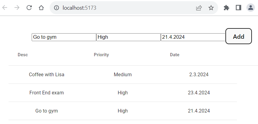
Now, your Todolist should look like the following screenshot and the todo table looks already more professional:
Column properties
- The column properties are used to define the column behavior. So far, we have only used the
fieldproperty in our column definitions. - You can find all column properties at https://www.ag-grid.com/react-data-grid/column-properties/
- By default, column sort is enabled. Set
sortableproperty tofalseto disable sorting on a column. - You can also get a column-based filter that filters rows using the spcified values. You can enble colmun filter by setting
filterproperty totrue. - Now, the
columndDeflook like the code below:
const [columnDefs] = useState([
  {field: 'desc', sortable: false, filter: true},
  {field: 'priority', filter: true},
  {field: 'date', filter: true}
]);
- Now, column headers also contain a 'hamburger'-menu that opens the column filter. The description column is not anymore sortable.
Styling cells
- We can use
cellStylecolumn property to define cell styling. The value of the property is a callback function that returns an object of css values. - In the example code below, the priority cell text color is red if the priority value is High.
const columns = [
  { field: "desc", sortable: true, filter: true },
  { field: "priority", sortable: true, filter: true,
    cellStyle: params => params.value === "High" ? {color: 'red'} : {color: 'black'} },
  { field: "date", sortable: true, filter: true }
];
Delete functionality
- Let’s implement the delete functionality, where the user can select a row, and when the delete button is pressed, the selected row is deleted.
- First, we have to enable row selection and set mode to single selection by using the
rowSelectiongrid prop.
<AgGridReact
  columnDefs={columns}
  rowData={todos}>
  rowSelection="single"
/>
- We should be able to get the selected row, and therefore we need access to the ag-grid component’s API. The API provides a method called
getSelectedNodes()that we can use to get the selected row index. - To get access to the Grid API, we can use the React
useRefhook function (https://react.dev/reference/react/useRef). The Reactrefcan be used to get direct access to a DOM element.
// Import useRef
import { useRef, useState } from 'react'

function TodoList() {
  const [todo, setTodo] = useState({ desc: '', date: '', priority: '' });
  const [todos, setTodos] = useState([]);
  const gridRef = useRef();
- By using
refprop we can make a reference to theAgGridReactcomponent. It allows us to access it's methods directly.
<AgGridReact
  ref={gridRef}
  rowData={todos}
  columnDefs={columnDefs}
  rowSelection="single"
/>
- The
AgGridReactcomponent's methods are in the Grid API (https://www.ag-grid.com/react-data-grid/grid-api/); therefore, we have to link our reference to the API. AG-Grid provides thegridReadyevent that is invoked when the grid has initialized and is ready for most api calls, but may not be fully rendered yet. We can useonGridReadyevent handler to get access to the grid API and store the grid API object for our reference. Then, we can use thegridRef.currentto call methods that grid API provides.
<AgGridReact
  ref={gridRef}
  onGridReady={ params => gridRef.current = params.api }
  rowData={todos}
  columnDefs={columnDefs}
  rowSelection="single"
/>
- Next, we add Delete button inside the
returnstatement and when the button is pressed, it callhandleDeletefunction.
return (
    <>
      <input
        placeholder="Description"
        onChange={e => setTodo({...todo, desc: e.target.value })}
        value={todo.desc} />
      <input
        placeholder="Priority"
        onChange={e => setTodo({...todo, priority: e.target.value })}
        value={todo.priority} />
      <input
        placeholder="Date"
        onChange={e => setTodo({...todo, date: e.target.value })}
        value={todo.date} />
      <button onClick={addTodo}>Add</button>
      <button onClick={handleDelete}>Delete</button>
      <div className="ag-theme-material" style={{width: 700, height: 500}}>
        <AgGridReact
          ref={gridRef}
          onGridReady={ params => gridRef.current = params.api }
          rowData={todos}
          columnDefs={columnDefs}
          rowSelection="single"
        />
      </div>
    </>
)
- Finally, we implement the
handleDeletefunction. We can use the grid API'sgetSelectedNodesmethod, which returns an array of selected rows. We are using the single selection mode; therefore, it only returns one row. The row index can be get from the row object'sidproperty. We use the JavaScriptfilterfunction to filter selected row from thetodosstate. Thefilterfunction creates a new array containing elements from the original array that meet a specific condition. It does not modify the original array but returns a new array with the filtered elements.
const handleDelete = () => {
  setTodos(todos.filter((todo, index) =>
      index != gridRef.current.getSelectedNodes()[0].id))
};
- If you select a row in the grid and press the Delete button, the selected row is deleted from the grid. If you don't select any row and press the Delete button, you can see an error in the console. We also have to check that one row is selected before filtering.
const handleDelete = () => {
  if (gridRef.current.getSelectedNodes().length > 0) {
    setTodos(todos.filter((todo, index) =>
      index != gridRef.current.getSelectedNodes()[0].id))
  }
  else {
    alert('Select a row first!');
  }
};
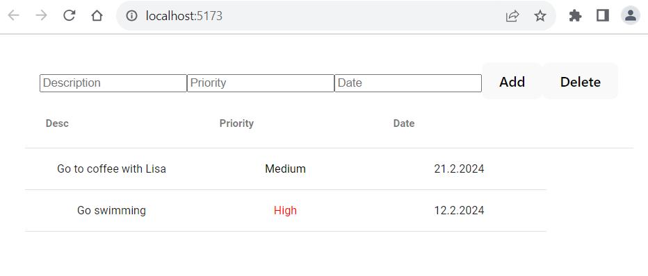
- Now, we have finalized our Todolist using the AG-Grid, and your Todolist should look like the following screenshot:
Next, we are going to style the rest of our Todolist app using the Material Design styling.