React Native Paper
React Native Paper (https://oss.callstack.com/react-native-paper/) is a popular open-source UI library for React Native applications. It provides a set of customizable and pre-designed components that follow Google's Material Design.
Installation
Install React Native Paper UI library to your project by typing the following command in your project's folder.
npm install react-native-paper
You also have to install react-native-safe-area-context to handle safe area. Safe areas are areas of the screen that are guaranteed not to be obstructed by system bars or notches on devices.
npx expo install react-native-safe-area-context
In the following example project, we will learn some of the components that library provides.
Example Project
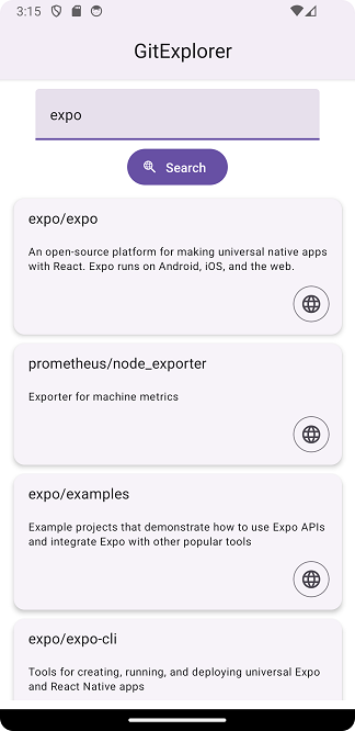
We create GitExplore app for searching GitHub repositories based on user-provided keywords. It is similar app that we already delveloped in the Networking section, but now we build the user interface using React Native Paper components. The app also allows users to view repository details in a browser.
Github REST API url to fetch repositories by keyword is https://api.github.com/search/repositories?q={keyword}.
The app looks the following:
Create a project
Create a new Expo project and install React Native Paper UI library:
npx create-expo-app@latest --template blank-typescript
cd gitexplorer
npm install react-native-paper
npx expo install react-native-safe-area-context
Let's first create a new component GitExplorer:
import { StyleSheet, View } from 'react-native';

export default function GitExplorer() {
  return (
    <View style={styles.container}>
    </View>
  );
}

const styles = StyleSheet.create({
  container: {
    flex: 1,
    marginTop: 10,
    backgroundColor: '#fff',
    alignItems: 'center',
    justifyContent: 'center',
  },
});
In the App component, we provide theme by using the PaperProvider component. The PaperProvider component ensures that all components have access to the necessary theme and configuration options. We also import GitExplorer component and render it in the App component.
import { PaperProvider } from 'react-native-paper';
import { StatusBar } from 'expo-status-bar';
import GitExplorer from './GitExplorer'

export default function App() {
  return (
    <PaperProvider>
      <GitExplorer />
      <StatusBar style="auto" />
    </PaperProvider>
  );
}
App header
Next, we will implement application app bar. Top app bars display navigation, actions, and text at the top of a screen. React Native Paper provides component Appbar that we will display in our App component. Appbar.Header is used to create top appbar. The mode prop can be used to define the height of the Appbar (small, medium, large, center-aligned).
import { PaperProvider, Appbar } from 'react-native-paper';
import { StatusBar } from 'expo-status-bar';
import GitExplorer from './GitExplorer'

export default function App() {
  return (
    <PaperProvider>
      <Appbar.Header elevated>
        <Appbar.Content title="GitExplorer" />
      </Appbar.Header>
      <GitExplorer />
      <StatusBar style="auto" />
    </PaperProvider>
  );
}
Now, you should see the app bar at the top of you app.
Button & TextInput
In the GitExplorer component, we need two states to store keyword and repositories.
import { useState } from 'react';
import { StyleSheet, View } from 'react-native';

type Repository = {
  id: number;
  full_name: string;
  description: string | null;
};

export default function GitExplorer() {
  const [keyword, setKeyword] = useState('');
  const [repositories, setRepositories] = useState<Repository[]>([]);

  return (
    <View style={styles.container}>
    </View>
  );
}
Then, we render TextInput component that allows user to input keyword that is used in the fetch request. The React Native Paper TextInput component have similar props than React Native component (such as value, onChange etc.). React Native Paper TextInput provides additional props for Material Design-specific features such as label. The label prop is used to provide a floating label for the input field.
The React Native Button component renders a basic button with platform-specific styling. It has a simple appearance and is not highly customizable in terms of design. React Native Paper's Button component, on the other hand, follows Material Design guidelines and offers more styling options out of the box. In our app we are using contained button and that can be defined using the mode props. We also display web search icon in our button using the icon props. See the list of supported icons in https://oss.callstack.com/react-native-paper/docs/guides/icons.
import { useState } from 'react';
import { Button, TextInput } from 'react-native-paper';
import { StyleSheet, View } from 'react-native';

type Repository = {
  id: number;
  full_name: string;
  description: string | null;
};

export default function GitExplorer() {
  const [keyword, setKeyword] = useState('');
  const [repositories, setRepositories] = useState<Repository[]>([]);

  return (
    <View style={styles.container}>
      <TextInput
        style={{ width: '90%', marginBottom: 10 }}
        label="Keyword"
        value={keyword}
        onChangeText={text => setKeyword(text)}
      />
      <Button mode="contained" icon="search-web">
        Search
      </Button>
    </View>
  );
}
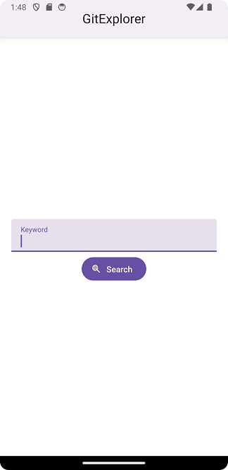
In this phase, your app should look like the image below:
Fetch
Next, we implement the network request to fetch repositories. Add the following function in your GitExplorer component.
const handleFetch = () => {
  fetch(`https://api.github.com/search/repositories?q=${keyword}`)
  .then(response => {
    if (!response.ok)
      throw new Error("Error in fetch: " + response.statusText);

    return response.json();
  })
  .then(data => setRepositories(data.items))
  .catch(err => console.error(err))
}
The handleFetch function is executed when the button is pressed.
  return (
    <View style={styles.container}>
      <TextInput
        style={{ width: '90%', marginBottom: 10 }}
        label="Keyword"
        value={keyword}
        onChangeText={text => setKeyword(text)}
      />
      <Button mode="contained" icon="search-web" onPress={handleFetch}>
        Search
      </Button>
    </View>
  );
Flatlist & Card
Then we display repositories using the React Native FlatList component. Now, each row is displayed using React Native Paper Card component (https://oss.callstack.com/react-native-paper/docs/components/Card/). To show text we use React Native Paper Text component that provides pre-defined text styles. You can see all styles in https://oss.callstack.com/react-native-paper/docs/components/Text/.
First, Import required component:
import { useState } from 'react';
import { Button, TextInput, Card, Text } from 'react-native-paper'; // Import Card and Text
import { StyleSheet, View, FlatList } from 'react-native'; // Import FlatList
Then render FlatList component:
  return (
    <View style={styles.container}>
      <TextInput
        style={{ width: '90%', marginBottom: 10 }}
        label="Keyword"
        value={keyword}
        onChangeText={text => setKeyword(text)}
      />
      <Button mode="contained" icon="search-web" onPress={handleFetch}>
        Search
      </Button>
      <FlatList
        style={{ marginTop: 10, width: '90%'}}
        data={repositories}
        renderItem={({item}) =>
          <Card style={{ marginBottom: 10 }}>
            <Card.Title title={item.full_name} />
            <Card.Content>
              <Text variant="bodyMedium">{item.description}</Text>
            </Card.Content>
          </Card>
        }
      />
    </View>
  );
Now, You should see the repositories in the list when you type a keyword and press 'Search'-button.
You can use React Native Paper List components also to display list tiles. You can read more about List components in https://oss.callstack.com/react-native-paper/docs/components/List/ListItem.
Web Browser
Next, we implement the feature that user can browse the github site from the list. We use Card.Action component to show a button inside the Card component. We use IconButton component which displays only an icon without a label. When the button is pressed, we call handleBrowse function and pass repository url as an argument.
// Import IconButton from react-native-paper

renderItem={({item}) =>
  <Card style={{ marginBottom: 10 }}>
    <Card.Title title={item.full_name} />
    <Card.Content>
      <Text variant="bodyMedium">{item.description}</Text>
    </Card.Content>
    <Card.Actions>
      <IconButton icon="web" onPress={() => handleBrowse(item.html_url)} />
    </Card.Actions>
  </Card>
  }
/>
Then, we implement the handleBrowse function that opens device browser and navigates to Github repository. We use Expo SDK's WebBrowser library that provides access to device's web browser. Install the WebBrowser library using the following command:
npx expo install expo-web-browser
Import WebBrowser:
import * as WebBrowser from 'expo-web-browser';
The handleBrowse is an asynchronous function declared using the async keyword. It takes a parameter url, which represents the URL of the repository to browse. The openBrowserAsync function opens the default web browser on the device and opens the provided URL:
const handleBrowse = async (url: string) => {
  try {
    let result = await WebBrowser.openBrowserAsync(url);
  } catch (error) {
    console.error('Error occurred while opening the browser:', error);
  }
}
When you press the icon button, device's default web browser is opened and it displays the GitHub repository page.
Loading indicator
In the final step, we implement loading indicator. The React Native Button component has laoding boolean props that determines whether the button should display a loading indicator.
First, we create a new state loading that is used to control whether a loading indicator should be displayed on the search button. When the component first renders, there are no ongoing loading operations; therefore, the loading state intial value is false.
const [loading, setLoading] = useState(false);
When handleFetch function is called, we set loading state to true. This indicates that a loading operation is in progress and loading indicator should be visible. When the response from the API is received or an error occurs, the loading state is set back to false. This indicates that the fetch operation has completed, and the loading indicator should dissapear.
const handleFetch = () => {
  setLoading(true);
  fetch(`https://api.github.com/search/repositories?q=${keyword}`)
  .then(response => {
    if (!response)
      throw new Error("Error in fetch: " + response.statusText);

    return response.json();
  })
  .then(data => setRepositories(data.items))
  .catch(err =>  {
    console.error(err);
  })
  .finally(() => setLoading(false))
}
In the Search button the loading prop is passed as loading={loading}, meaning it takes the value of the loading state defined in the component's state.
<Button
  loading={loading}
  mode="contained"
  icon="search-web"
  onPress={handleFetch}
>
  Search
</Button>
Now when type a keyword and press Search button, you should see the loading indicator inside the button.